5 Timeless Paint Colours
- Aug 10, 2024
- 2 min read
Updated: Jul 29, 2025
When it comes to interior design, the possibilities are limitless, especially in the realm of paint choices. Browsing through paint samples can be overwhelming, and a small piece of a color can only provide limited insight into how it will appear in your living space.
Although design preferences change over time and trends come and go, we have selected our top five Benjamin Moore timeless paint colours for you to consider. Take a look at how they are showcased in our recent projects and envision creating your own style around one of these reliable choices!
Westmount Kitchen Project.
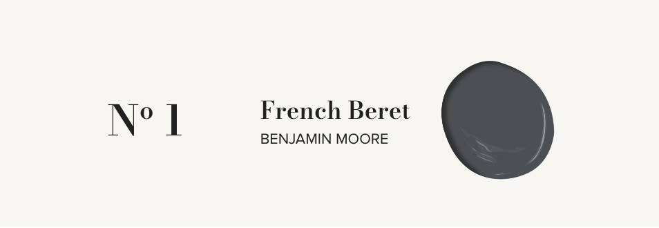
Dark hues are experiencing a significant resurgence! The French Beret provides an ideal touch of gentle contrast and is among our top choices for walls and millwork. This shade is a dark grey with a touch of blue, offering a contemporary, more neutral twist on the traditional navy color.
Leclair Home Living Room Project.
Opting for a timeless white shade is consistently a fantastic choice. Chantilly Lace ranks high among our favored paint hues, offering a pure, sharp, and genuine white hue devoid of blue or yellow hints. This color is ideal for enhancing walls, ceilings, and trim in any room.
Le Plateau Project.
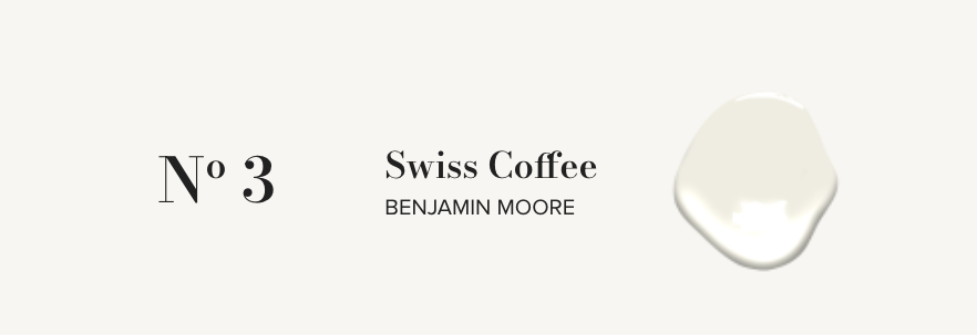
There is a significant trend towards using off-white walls. Swiss Coffee is a particularly cozy off-white shade that works well in more classic or transitional environments. Combining Swiss Coffee with the bright white of Chantilly Lace as a highlight color for architectural details is also a favorite. This combination brings richness and warmth to a room, maintaining a neutral and contemporary feel.
LD Vignette.
Being neutral doesn't necessarily imply being white! Thunder offers a deeper neutral tone and presents a contemporary option to Swiss Coffee, suitable for both warm and cool environments. Thunder looks fantastic when combined with white baseboards or complemented with coordinated trim to achieve a seamless monochromatic appearance.
Bay Area Project.
For years, we have been using black paint colors in our designs. Recently, we have been drawn to the off-black shade of Blacktop. It provides a great way to introduce strong contrast without the harshness of a true black.
DESIGNER TIP: Our current preference is for a matte finish on walls and ceilings, complemented by an eggshell finish on millwork, trim, and doors. In areas with high foot traffic, we suggest using eggshell on the walls and a satin finish on millwork, trim, and doors.
Looking for more paint inspiration? Check out our favourite white paints!


Comments